A totally interesting piece about designer Tracy Ma, art director at the New York Times Style section. Beautiful work, straddling prolific form-giving and thoughtful commentary (and creative coding).
A totally interesting piece about designer Tracy Ma, art director at the New York Times Style section. Beautiful work, straddling prolific form-giving and thoughtful commentary (and creative coding).
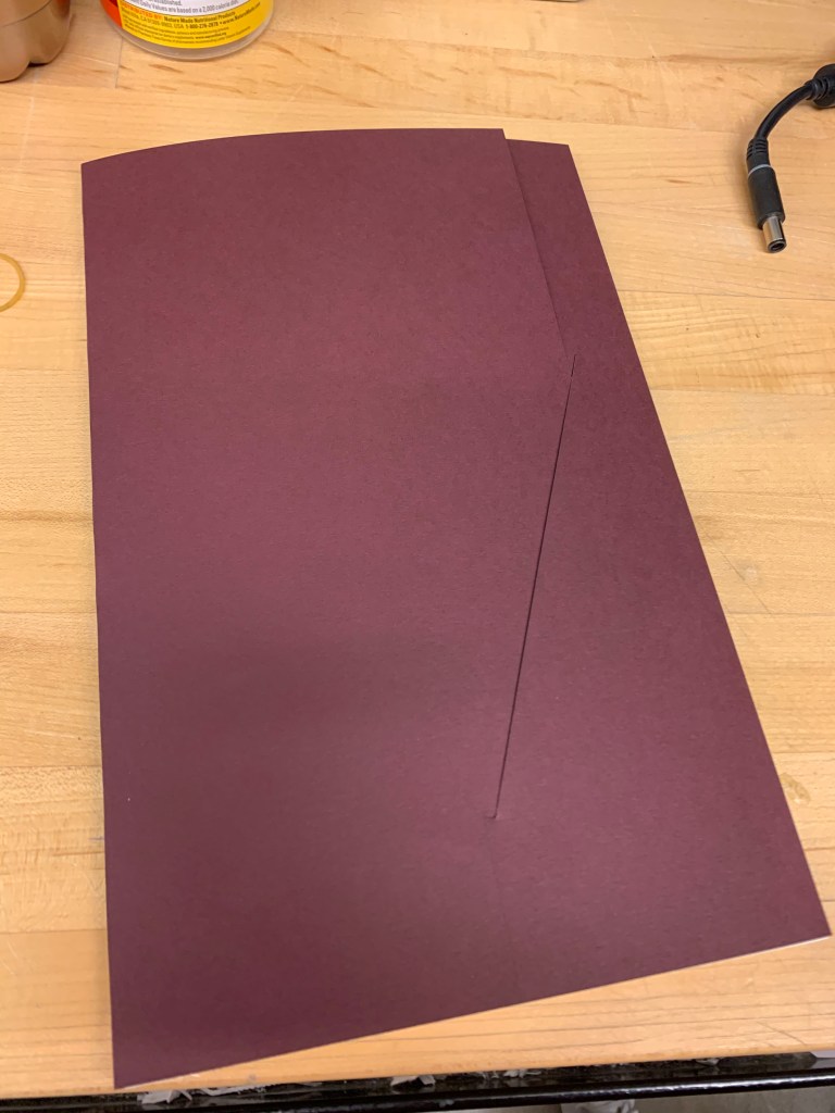
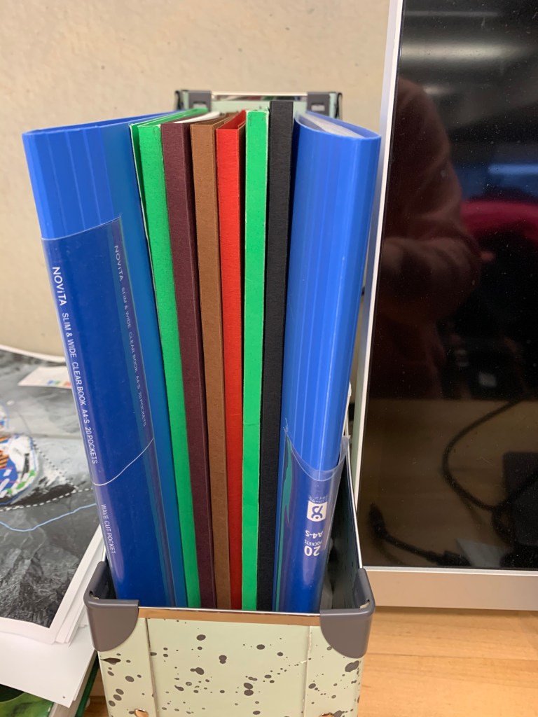
Hi everyone here are some photos of the folder designed for our prints. I tried multiple iterations, and the one I am posting here is my favorite.

Typographic Excerpts from Bitter English, by Ahmad Almallah; pages 3, 4, 7, 8 and 9
And I want you to mix font weights too (it’s a SADE song, go look it up.).
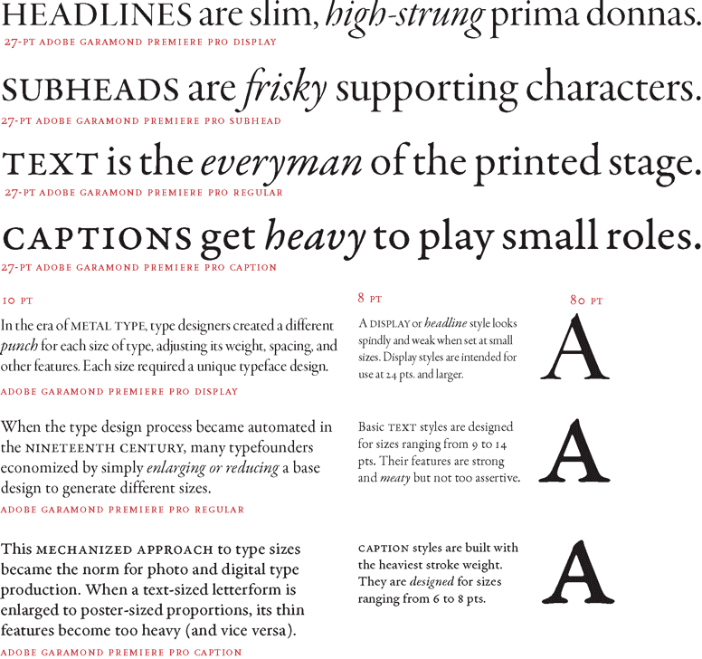
I came across this on Reddit the other day on this comprehensive overview of how to use typefaces and the common mishaps we run into. Even though I consider myself knowledgeable in terms of typography, I still learned a lot of new things from scrolling down the newsletter.

Mixing fonts of different weights should not be scary. It may look chaotic at first, but I really think it’s a neat way to emphasize within a word or a small statement. However, the cardinal rule is to skip one tier of weight between fonts in the same family or use two compatible but different fonts of not the same family.
Note the schedule with Open Studio Hours on the Common press site. The class has made arrangements with Mary to accommodate typesetting, printing and clean up over the next 2 weeks. Please check when you can work and check with me or Mary if you have any questions. DC
What a cruel invention this is. If you have not believed in the power of good spacing between individual letters in a typeface, you will be convinced after seeing this monstrous Hell-vetica (a badly kerned font based on Helvetica).

As I was doing the visual studying for this week’s reading, I found some interesting designs on Pinterest. I think they are a great transition from our logo-design project to typographic project.
They also relate to an idea from reading, saying that when people need to sTaRe into a d3s1gn, they’re more likely to remember it.


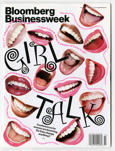
Theme: Friction
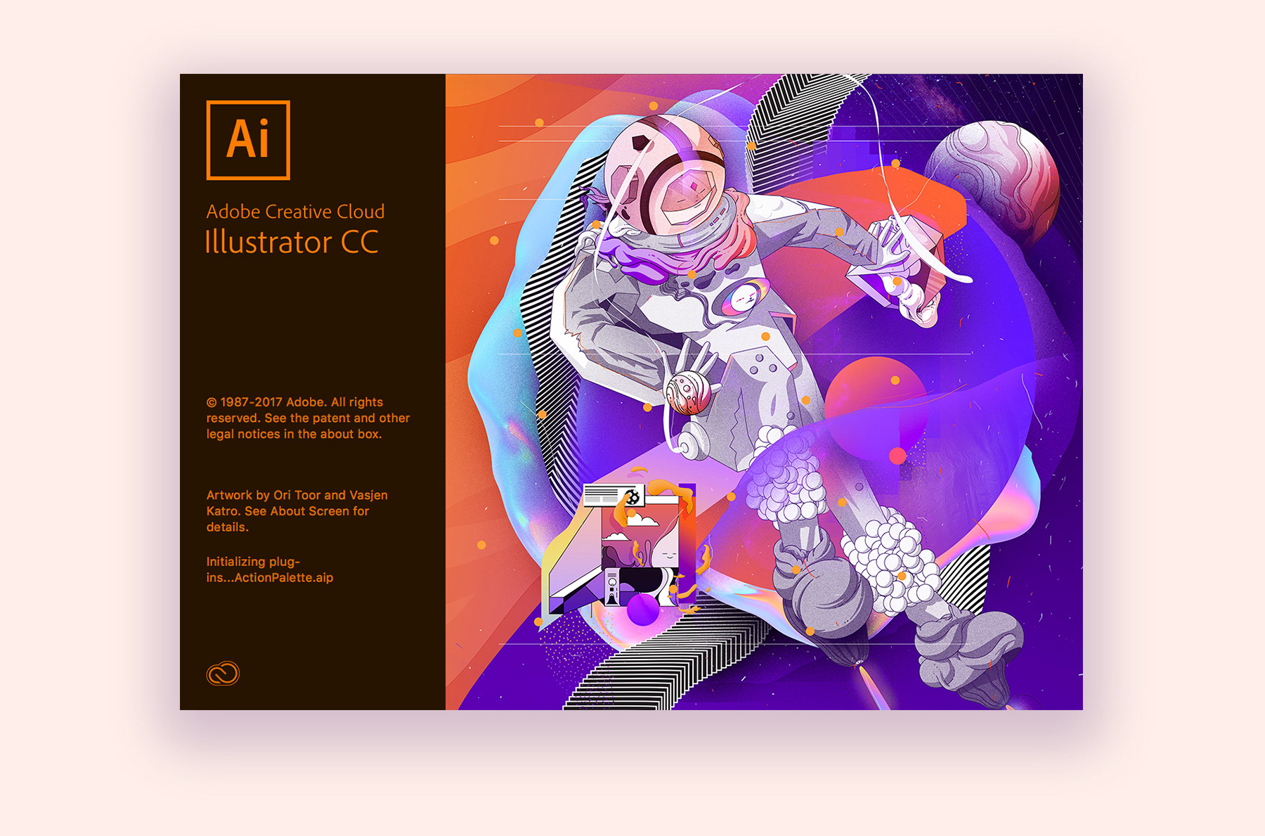
Ori Toor is an illustrator that I’ve been following for a while. I thought it would be fun to share his work given his dynamic approach to composition. Although we will be working primarily with text on this next project, Ori Toor’s work shows a lot of different ways you can split up the space. His work is very much rooted in design. He puts together basic shapes in unique ways, creating pieces that have been showcased in several magazines (and the Adobe software!).
For a look into more of his art, his website is here.
