I got a good laugh from this SNL short: https://www.youtube.com/watch?v=jVhlJNJopOQ

I got a good laugh from this SNL short: https://www.youtube.com/watch?v=jVhlJNJopOQ
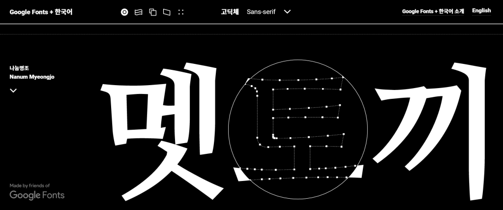
Hangul is a writing system that is one of the most phonologically faithful in the world. You almost always see what you pronounce. Each glyph in Hangul is a syllabic block. Google created this site showcase the Korean typefaces that they have and how they can be flexibly applied to web design. A lens guide you through each glyph revealing Adobe Illustrator-like anchor-points-and-stroke structure. All the fonts there are open sourced and available through Github.
I learned about this from the Weekly Typographic podcast made by The League of Movable Type. Unfortunately, they have discontinued making these podcasts, but the past episodes and newsletters still worth to be checked out.
Historically, modern typeface design for East Asian glyphs has been reactive to that of Latin letters in the West. The gravity center, kerning, and tracking of these glyphs are fundamentally different than those of Western letters. Moreover, there are a set number of letters with variations while the number of glyphs exist in East Asian languages is enormous. Among these glyphs, Chinese (Han) characters are the ones that Adobe’s new font sets target to standardize. Over the course of centuries, the same Han characters used in Greater China, Japan, and Korea have developed their own idiosyncrasies. See below for an example how the same character has different features in glyphs specific to certain regions of East Asia:

Type designer at Adobe went through a painstaking process to hand draw all the glyphs, both with and sans serifs.
Unlike many exclusive typefaces only available through a subscription to Adobe Creative Cloud, Source Han Serif and its sans counterpart are made open sourced and users can download and deploy them from GitHub, democratizing good type design in East Asia and in the world. More importantly, this project brought together experts from different East Asian countries and gave them agency and the power of creative decision-making in type design.

Extreme ligatures and type sculpting created controversy.
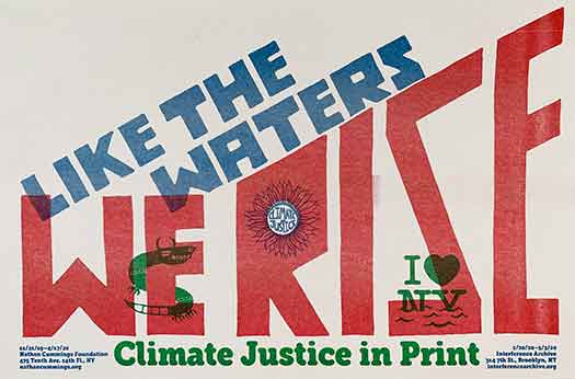
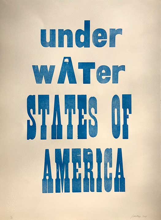
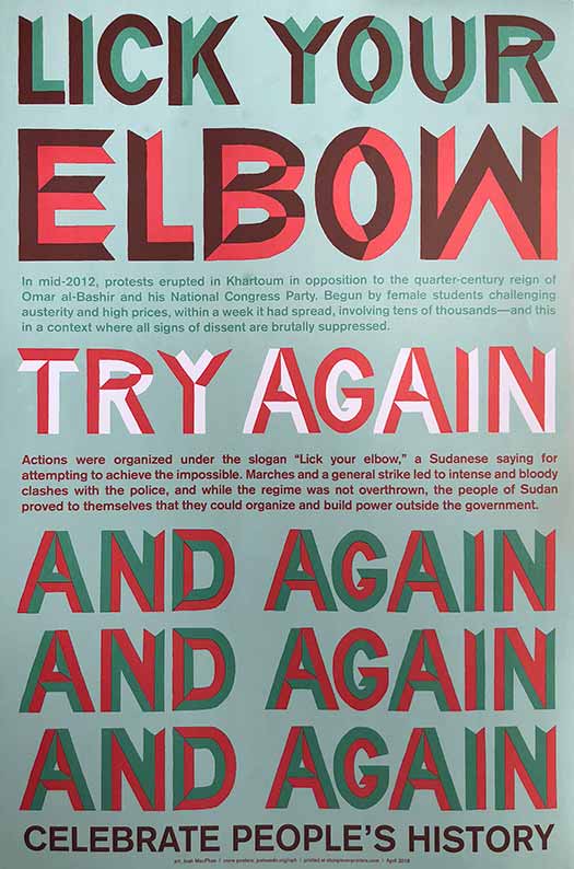
Josh MacPhee came onto my radar after I saw an event with him as a guest artist featured on the Sach’s Program for Art Innovation Facebook page. He is a designer, artist, and archivist focusing on social movements. He is a founder of Justseeds Artists’ Cooperative and Interference Archives, based in Brooklyn, NY.
Much of his work focuses on social justice. He also incorporates a lot of printing techniques into his work such as letterpress, risograph and screen printing. His work is vibrant, eye-catching, and has great composition.
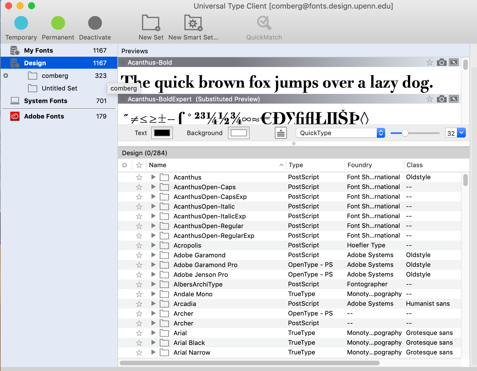
To access the fonts on the Penn Design server launch the Universal Type Client with your Penn Design login – there are many fonts here beyond what is available on Adobe Type Kit.
As we kick off the letterpress project for the poet, I’d like to share a post about how a designer made custom fonts using real flower samples she collected from the wild.
–Susie
From Sophy Lee at IDEO
https://www.ideo.com/blog/designing-a-custom-font-from-real-flowers
My father always told me the most beautiful and creative art in the world can be found in nature. Growing up in Korea, visiting botanical gardens was our family ritual—I even kept a journal where I picked leaves and flowers, and dried them in its pages. These memories and the spirit of nature helped me build my creative world.

My childhood journal, where I kept flowers and leaves from the gardens I visited with my family.
As an adult, it’s been important to me to use my design skills to recognize how much my father and my time in nature helped shape who I am. In college, my thesis project “FLOA” was a tribute to flowers and my father (FLOA = flower + appa—“dad” in Korean.) It was a small flower garden with different sizes of flower pots filled with lilies, dandelions, and roses. Working on the project created a special moment for me and my dad.
That was the first time I created something to honor the impact my father and our time in nature had on me. Years later, at IDEO, I started working on a project to redesign flowerpot systems and plant care instructions for consumers. Through the design research process, I got to observe how people take care of thousands of plants, how they are nurtured, and how they travel to consumers. I started to feel like a flower doctor, figuring out how to create a flowerpot that would best help them grow. I wanted to communicate that message to others, that caring for flowers isn’t entirely unlike caring for our own human bodies. To share that message, I decided to create a font system that combines the visual styles of botanicals and x-ray imaging. It would be a tribute to my dad and the connection I feel to nature, and hopefully inspire others to feel that same connection.
Instead of relying on existing x-rays of flowers, I decided to use the flowers from my memories to make the font. I went back to the journal of flowers I’d kept for 20 years and scanned them to convert them into a digital format, then applied the x-ray effect and arranged them into an alphabet. I named the font Small Forest.

Here, I am holding a poster sharing the final Small Forest alphabet. This was a very meaningful moment for me.

Small Forest comes to life!
I then connected with my IDEO colleague Todd Vanderlin, who is a genius creative coder. He used the flower scans to create an interactive digital experience that allows people to draw with flowers, stems, and leaves. Lines drawn by the user turn into beautiful botanicals before their eyes.
The program does not use any fancy machine learning algorithms or computer vision techniques. Todd wanted me to choose the direction, orientation, and type of each flower, building my own library of botanicals.
The algorithm performs based on the way I designed and categorized the flowers.
The software starts by analyzing the line stroke, search for long continuous segments based on the change in angles. The segments then source flower parts based on their tags and configurations.
Segments of a line are matched to the sizes and shapes of the flowers.
The first test of the completed program.
When Todd showed me how he created the coding system, it was mind blowing. I felt like I was on a spaceship traveling to the future. We unveiled the digital experience at an event that IDEO Cambridge and MIT Media Lab hosted earlier this year called Future Fest, an interactive art show that invited guests to explore the interactions of art, technology, and humanity. I loved watching guests interact with the botanicals and create their own nature-inspired art.

My son Ethan interacting with Small Forest during the event. It was amazing to watch Ethan, who picks flowers and leaves wherever he goes, creating beautiful botanical art with only his fingertips.
Small Forest is a project that ties me to my dad and my childhood. But thanks to Todd, it became something much bigger—something that can delight others, and inspire them to take on art projects of their own. As you think about your own journey, don’t forget to recognize the people and experiences that got you here, and to use your skills to create something that just might inspire someone else.
Special thanks to Todd Vanderlin for collaborating with me on this project.
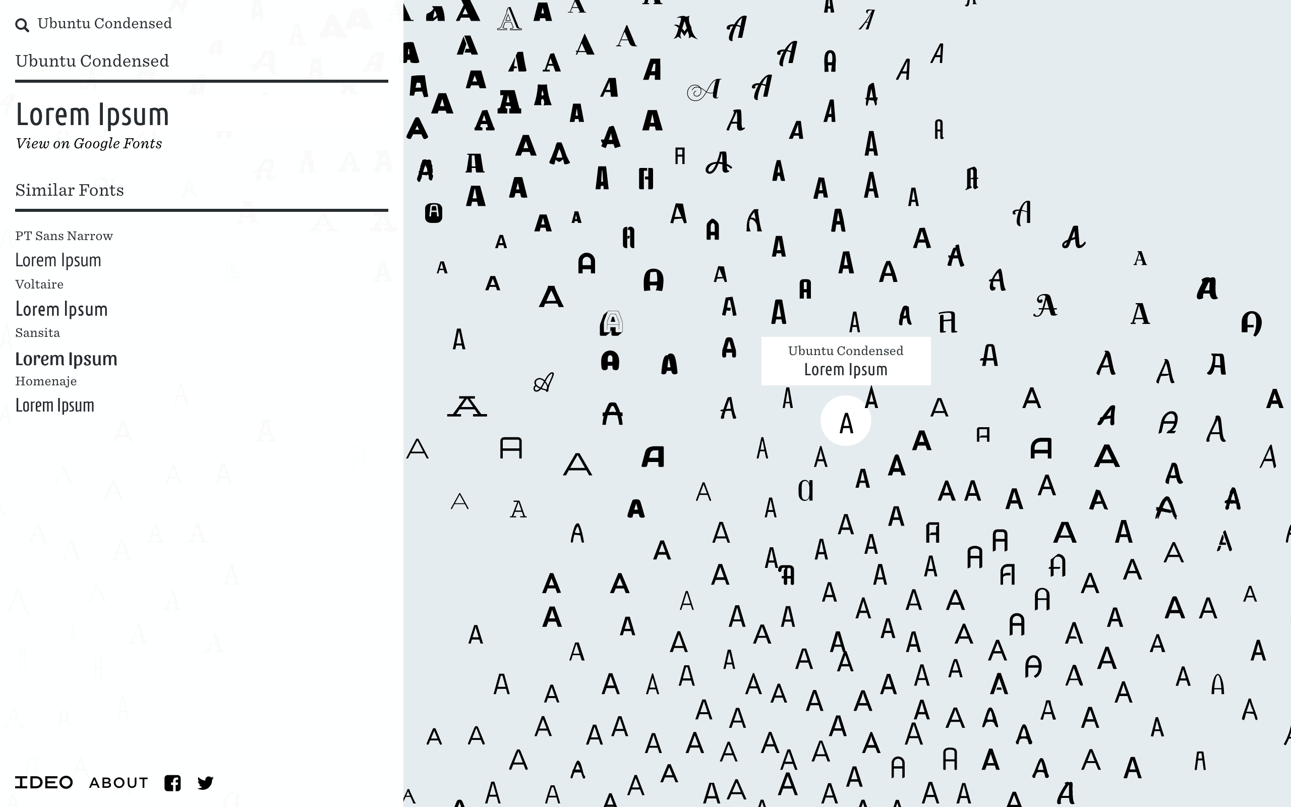
Designers at IDEO wanted to bring artificial intelligence to the world of fonts, so they created Font Map, a quick experiment to see how machine learning can address challenges in design.
Font selection is one of the most common visual choices designers make—and most fall back on old favorites, or search for a font within categories. By leveraging AI and convolutional neural networks to draw higher-vision pattern recognition, we have created a tool that helps designers understand and see relationships across more than 750 web fonts.
Try it here
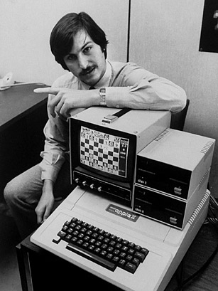
Most people know Steve Jobs for co-founding Apple and revolutionizing technology. However, in doing so he also brought something to computers that is often overlooked. He gave Macintosh users the ability to choose between a variety of fonts.
The idea that computers used to come with only one font to choose from was shocking to me, and I can credit this luxury to Steve Jobs.

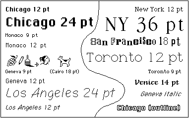
Not only did he include well known fonts like Helvetica and Times New Roman, but he used fonts unknown to the public. With the help of Susan Kare, he took the typefaces he learned in a college art class, named them after his favorite cities, and offered them on the new Apple computer.
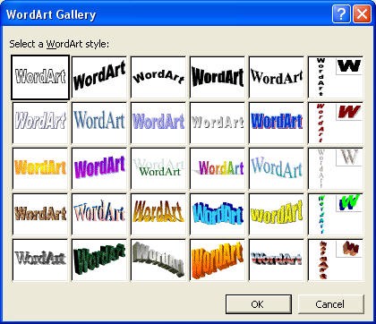
I remember using all the WordArt (see above) Microsoft word had when I was barely in elementary school. It’s weird to think there was ever a time when you needed to hire an artist to create the font you wanted, but if you want to look at the article you can read more about it here.
